A 6.5 km run on Jan 29 after a small workout outdoors

Pretty a regular one, however, the data (.tcx taken from strava) are good, and some nice looking plots were produced as a result. The data presented in a human-friendly format really improve the understanding of how parameters in the running stats are linked together. This time it will be about distance, elevation grade, speed and heart rate. The idea is to use that for boosting running performance.
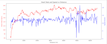
Heart rate vs speed shows some slight correlation between increasing the pace and the heart rate slightly going up.
Still, it might be interesting to add a little bit more context, for example, elevation grade data could make the graph more explanatory.
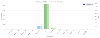
As it can be seen here, mild downhill sections slightly prevail over mild uphill parts of the route. It actually can explain why heart rate values are lower in the first half of the run.
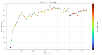
The latest plot makes the picture even cleaner. The "arrow up" markers indicate incline there, the "arrow down" markers show that there's a decline. Color indication is also pretty intuitive, red color means more intense pace, blue markers stand for relaxed or easy pace.
This approach definitely can be used for the next runs as well. Keep moving!


