12 km run: elevation compared in Garmin, Strava and MapMyRun data
An easy 12km run, well known terrain, a short looped route - perfect conditions to compare elevation data coming from raw .tcx files. Given the previous experience with glitches, fluctuations and unexpected values of elevation in the stats, it's really interesting to know, which platforms offer more reliable data.
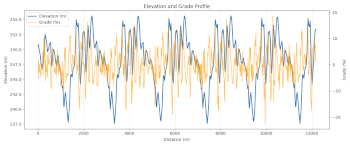
This is how the elevation profile and the grade values look in Garmin:
As it can be seen from the plot, the elevation drops and rises sharply in every loop. The drops and rises result to some crazy elevation grade values represented by the orange line of the graph - up to 17-18%, which is not reasonable for this route. The pattern is repeatable, so it's not likely that these rapid changes are caused by random fluctuations or the sensor glitches.
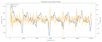
The same plot built with data exported from MapMyRun:
The elevation values look a bit different here, apparently, some filtering is applied, however, the perfectly repeatable pattern that was present in Garmin's data, is not the case in MapMyRun data. Inconsistent filtering results to even weirder grade values reaching more than 20%. I assume, if it had been true, it would have turned this gentle route into something barely runnable.
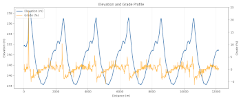
Finally, the same plot based on the raw data from Strava:
Actually, this graph looks very reasonable. The first spike is preserved, which is good (there's a bridge there, it really contributes a few meters of elevation). All the next slopes keep their repeatable pattern, and the grade seems to be within -5% to 5% range. I guess, it's a clear winner among these three, for this particular run.
Hopefully, the next workouts will give even more interesting insights. Stay tuned!


