A blog starter: a 25 km run
To give an idea on what this blog is going to look like, let's start with a 25k Sunday run on 25th of January.
This is Denys -->

This is how the run looked like -->
The data are taken from the .tcx file exported from Garmin Connect. The idea is to use the data to get some insights for improving running economy or, probably, adjusting the training process to achieve better results in the races.
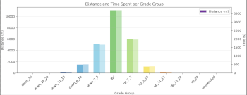
The first plot shows a distribution of different elevation profiles (flat, mild uphill, steep uphill, etc.) over the distance and time. As it can be seen from the plot, this particular run doesn't contain anything very special. Practically, a half of the route (~12km, or around an hour in terms of time) is flat, a quarter is a mild uphill, another quarter is a slight downhill. The uphill parts of the route which can be considered steep (like, 6-10% of incline) seem to take somewhat around 1km overall, which looks pretty reasonable.
Besides that, a very minor amount of even sharper incline is present in the plot, however, those parts of the route were probably too short to be noticed.
Anyway, more runs, more data to come, and hopefully, we can get more useful insights. Stay tuned.
